Travis's Portfolio
Menu
Close
01.
Home
02.
Work
03.
Contact
Travis
Liu
GRAPHIC DESIGNER
I design
branding
,
marketing
and
editorial
that communicates clearly and connects with people
Projects
Community Business
Community Business
BRAND IDENTITY, REBRANDING
BRAND IDENTITY, REBRANDING
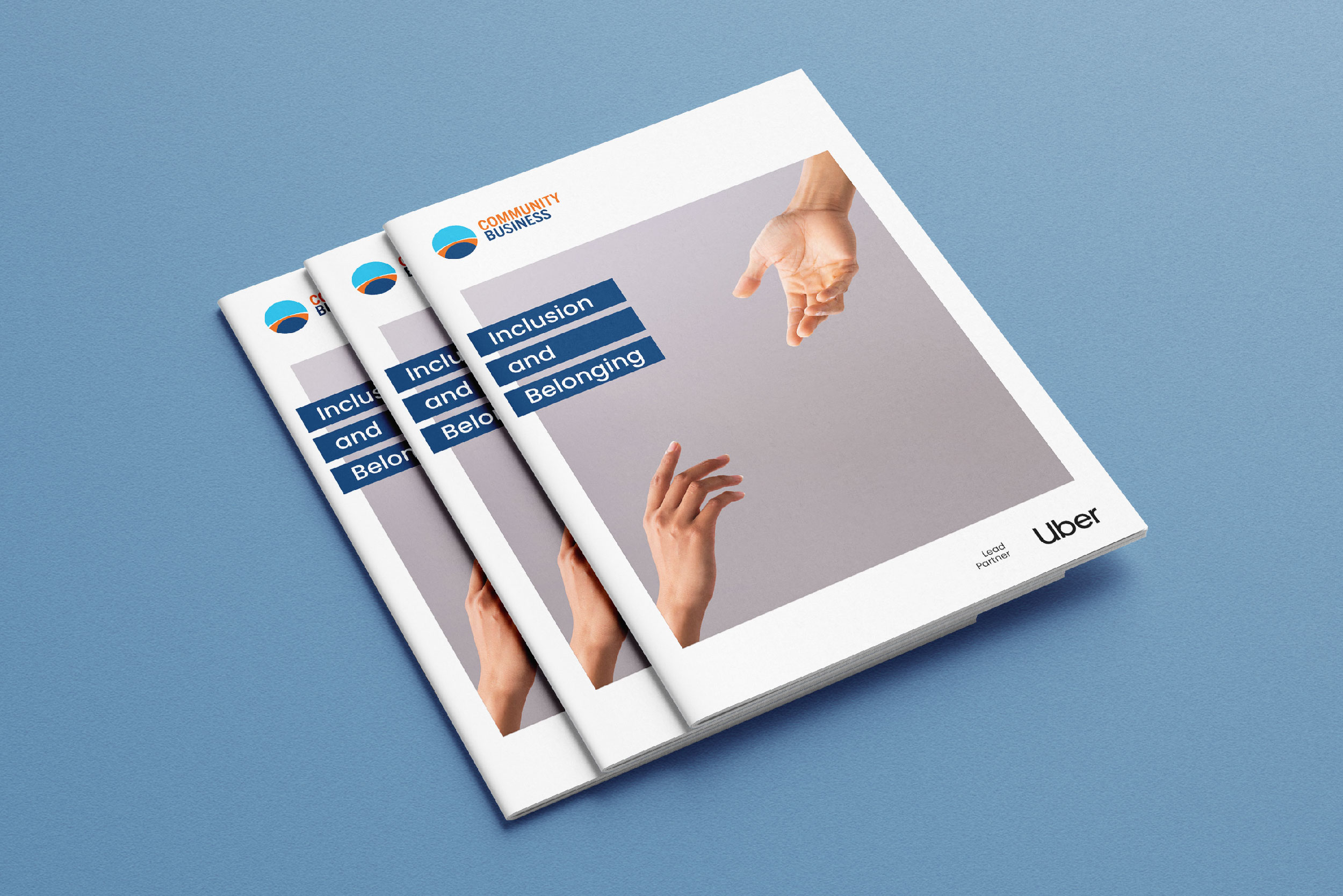
Inclusion & Belonging
Inclusion & Belonging
EDITORIAL
EDITORIAL
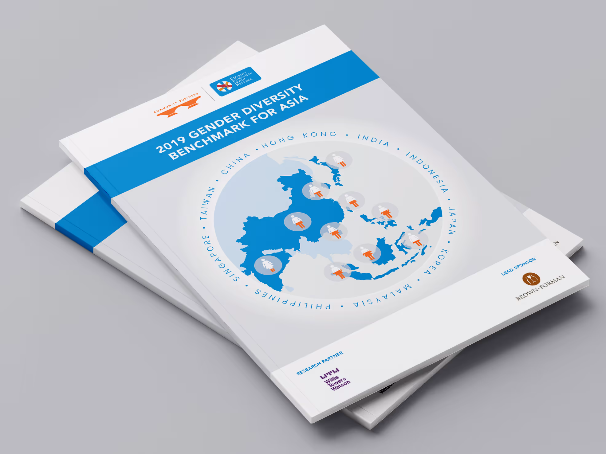
Gender Diversity Benchmark
Gender Diversity Benchmark
EDITORIAL
EDITORIAL
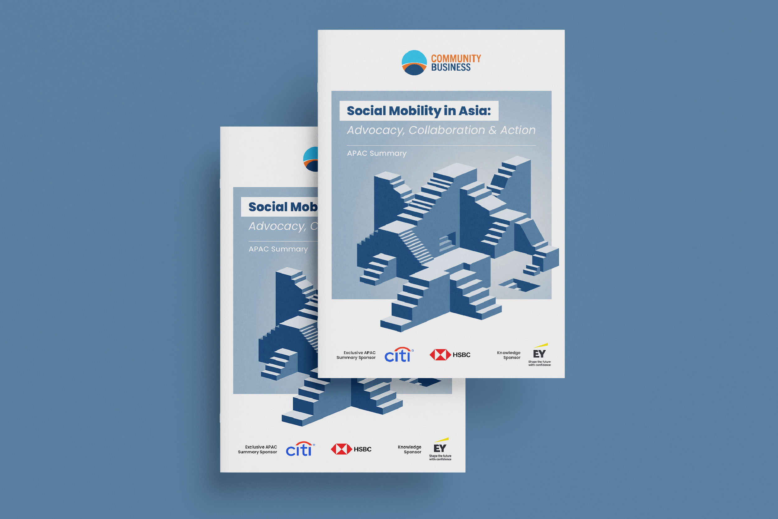
Social Mobility Campaign
Social Mobility Campaign
MARKETING, EVENT, EDITORIAL
MARKETING, EVENT, EDITORIAL
Meinhardt Hong Kong
Meinhardt Hong Kong
BRAND IDENTITY
BRAND IDENTITY