BRAND IDENTITY・NONPROFIT
Community Business Rebranding
Solo-led rebrand of a 20-year-old nonprofit identity, consolidating a fragmented brand system into a cohesive visual language used across Asia.
ROLE
Brand Identity, Visual System, Iconography
CLIENT
Community Business
TYPE
Nonprofit, Hong Kong
WHY DID IT NEED A REBRAND?
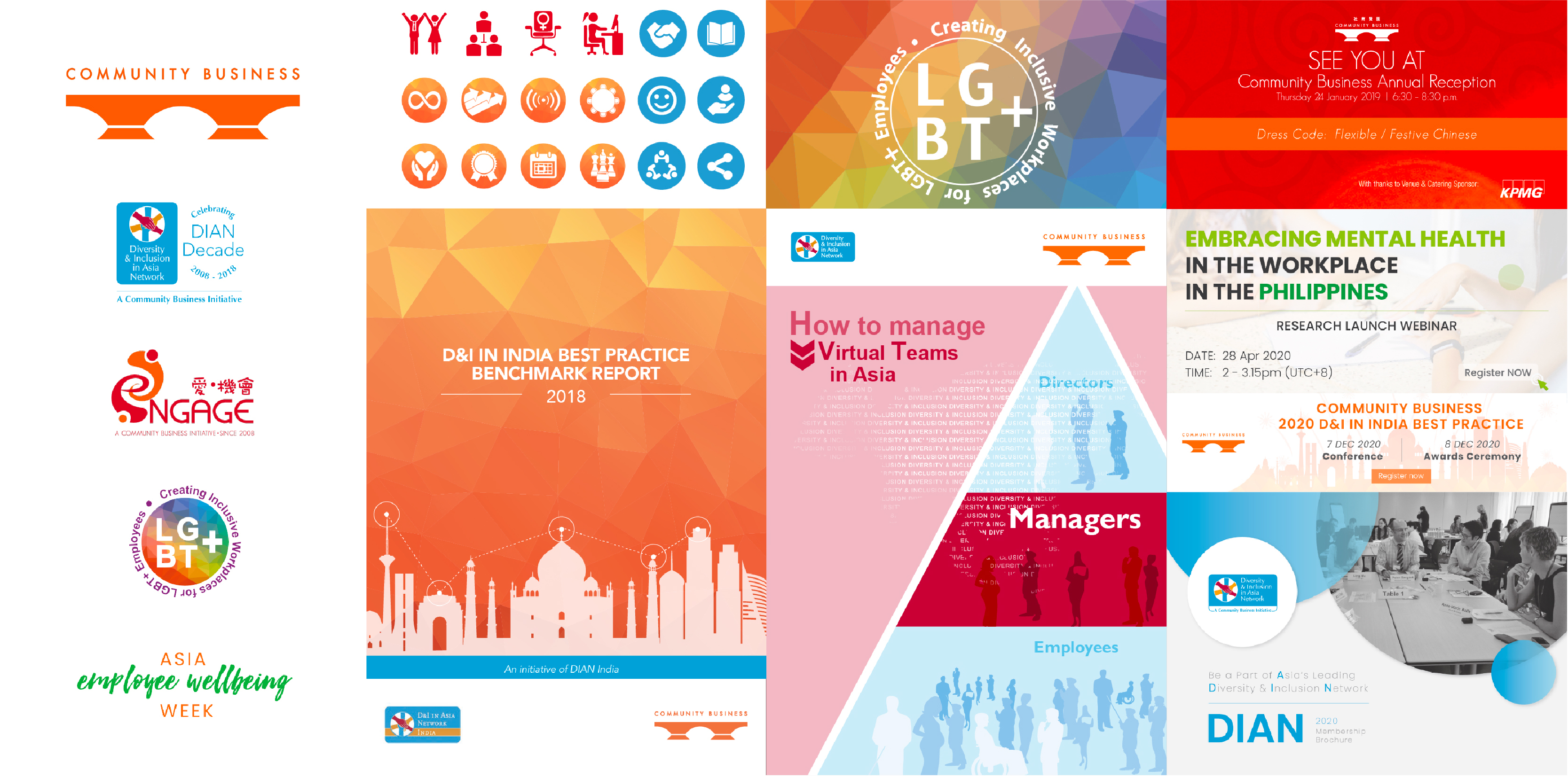
Community Business was founded in 2003 with a visual identity that had grown fragmented over time. By 2021, the organisation had accumulated multiple sub-brands that felt disconnected from each other and from the masterbrand, with some clients not realising the sub-brands were part of CB at all. The identity no longer reflected the organisation's scale, maturity or ambition across Asia.
Old brand materials
MY role
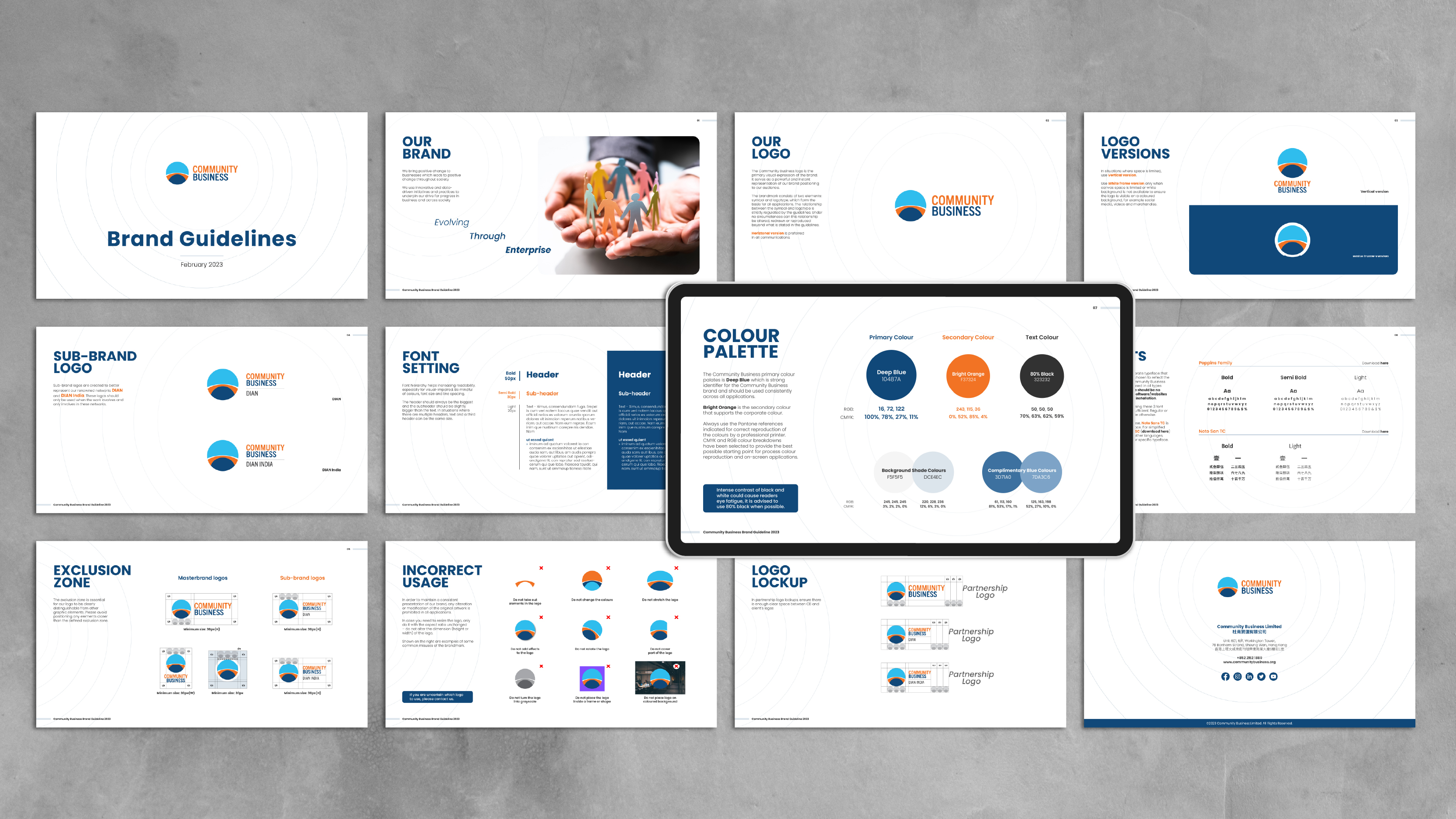
As the sole in-house designer, I was responsible for everything after the logo, including colour system, typography, tone of visual language, iconography, templates, rollout and ongoing maintenance. I gathered feedback from staff across teams, worked with my manager (Head of Marketing) on direction and sign-off, and presented the final direction to the CEO for approval.
Approach
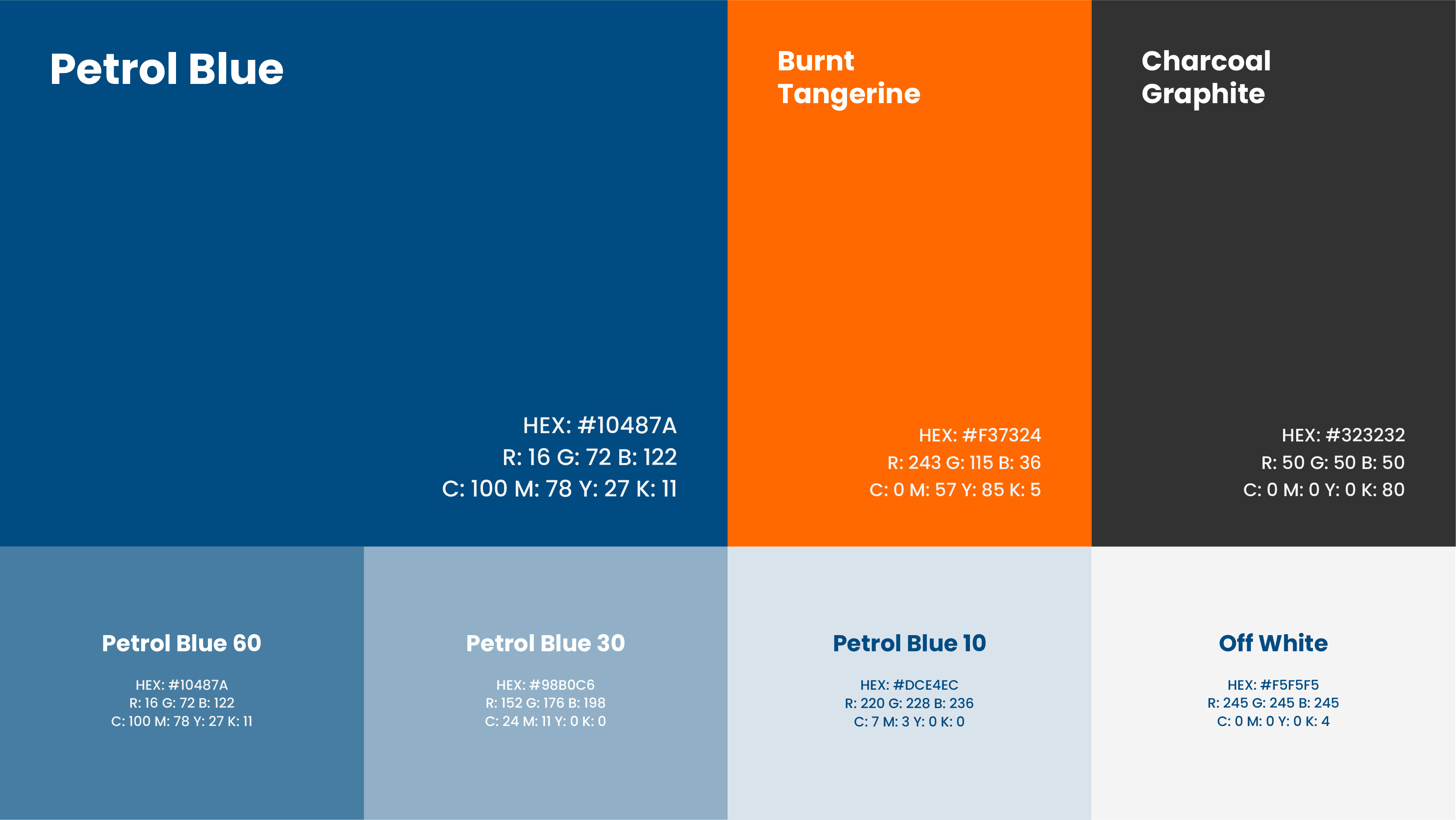
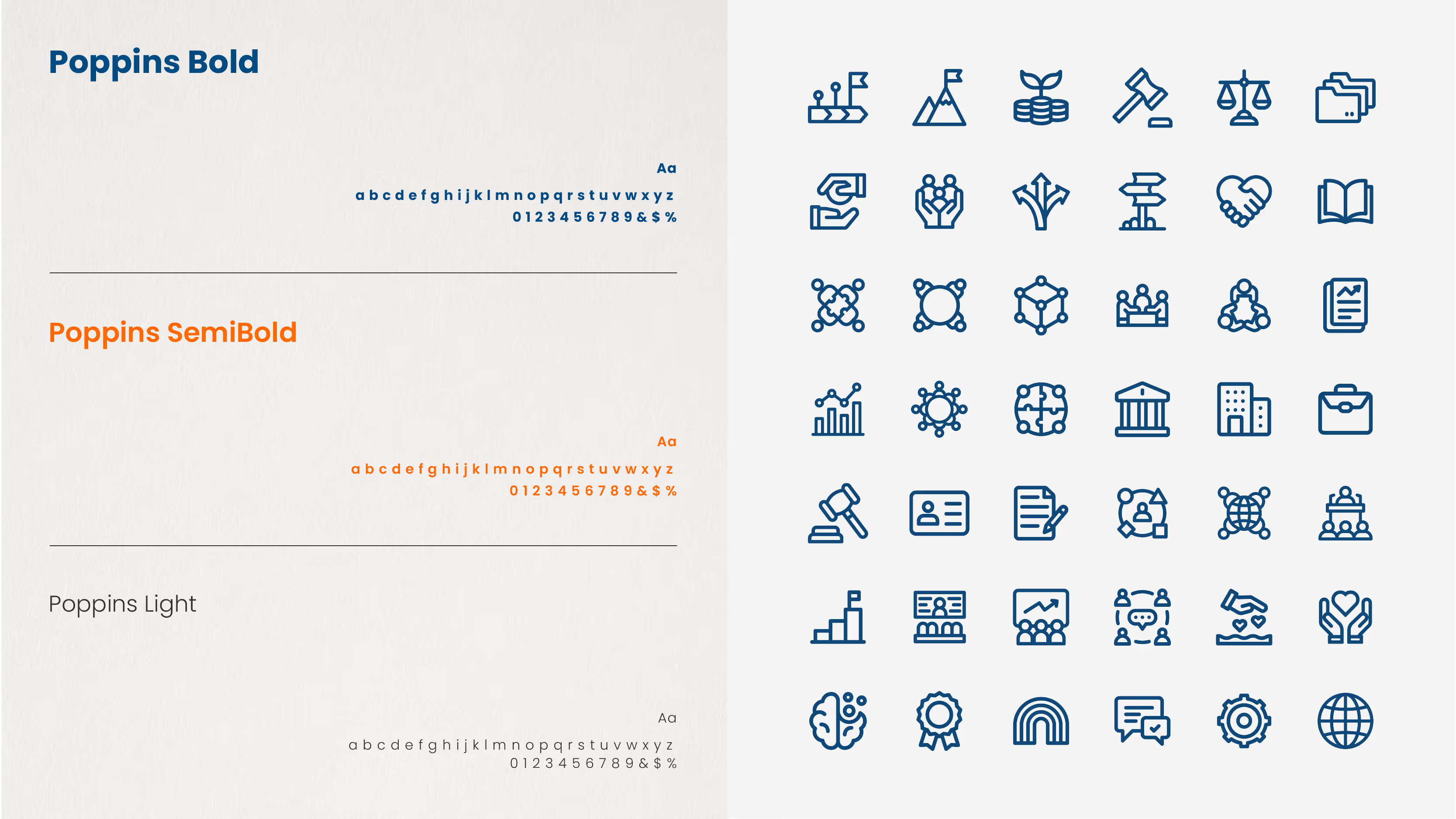
The core challenge was consolidation without erasure. CB had real brand equity built over 20 years that couldn't simply be discarded. The existing bridge concept in the logo was retained as a foundation, but the surrounding system was rebuilt from scratch: a refined colour palette, a stronger typographic hierarchy and a custom icon set designed to unify the sub-brand ecosystem under one visual language.
Challenge
Working as the sole designer without a formal agency process meant every decision had to be practical as well as considered. The system needed to be simple enough for non-designers across the organisation to use consistently. Balancing internal stakeholder opinions, with no design brief to anchor conversations, while maintaining a coherent creative direction was the central tension throughout.


Outcome
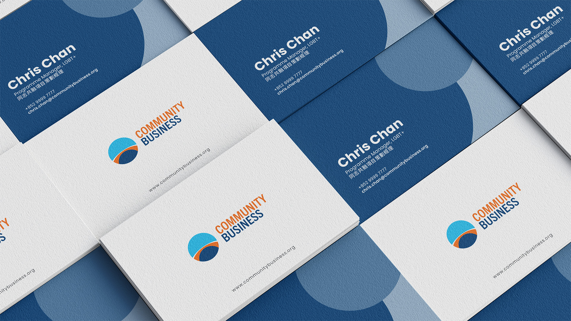
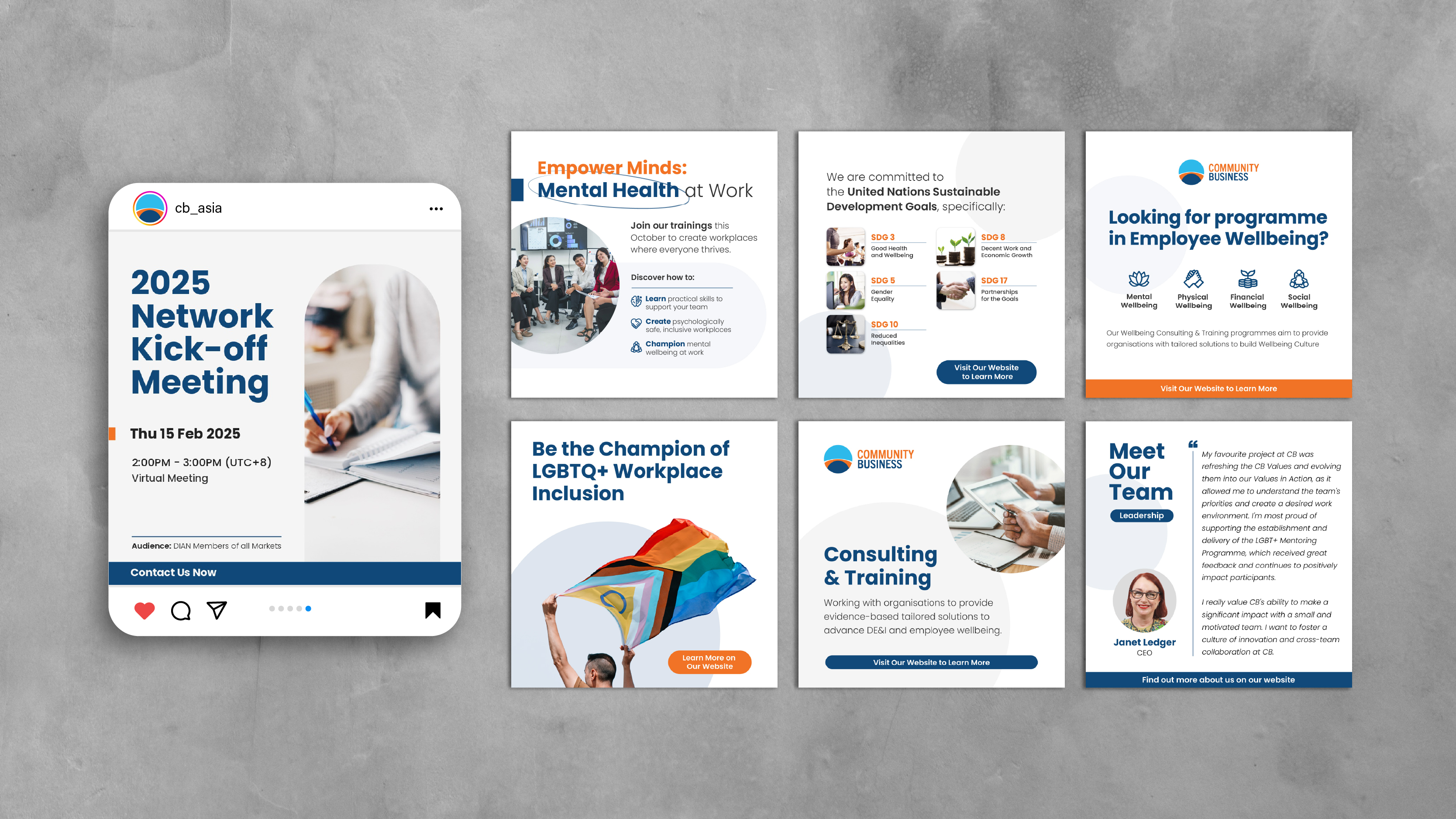
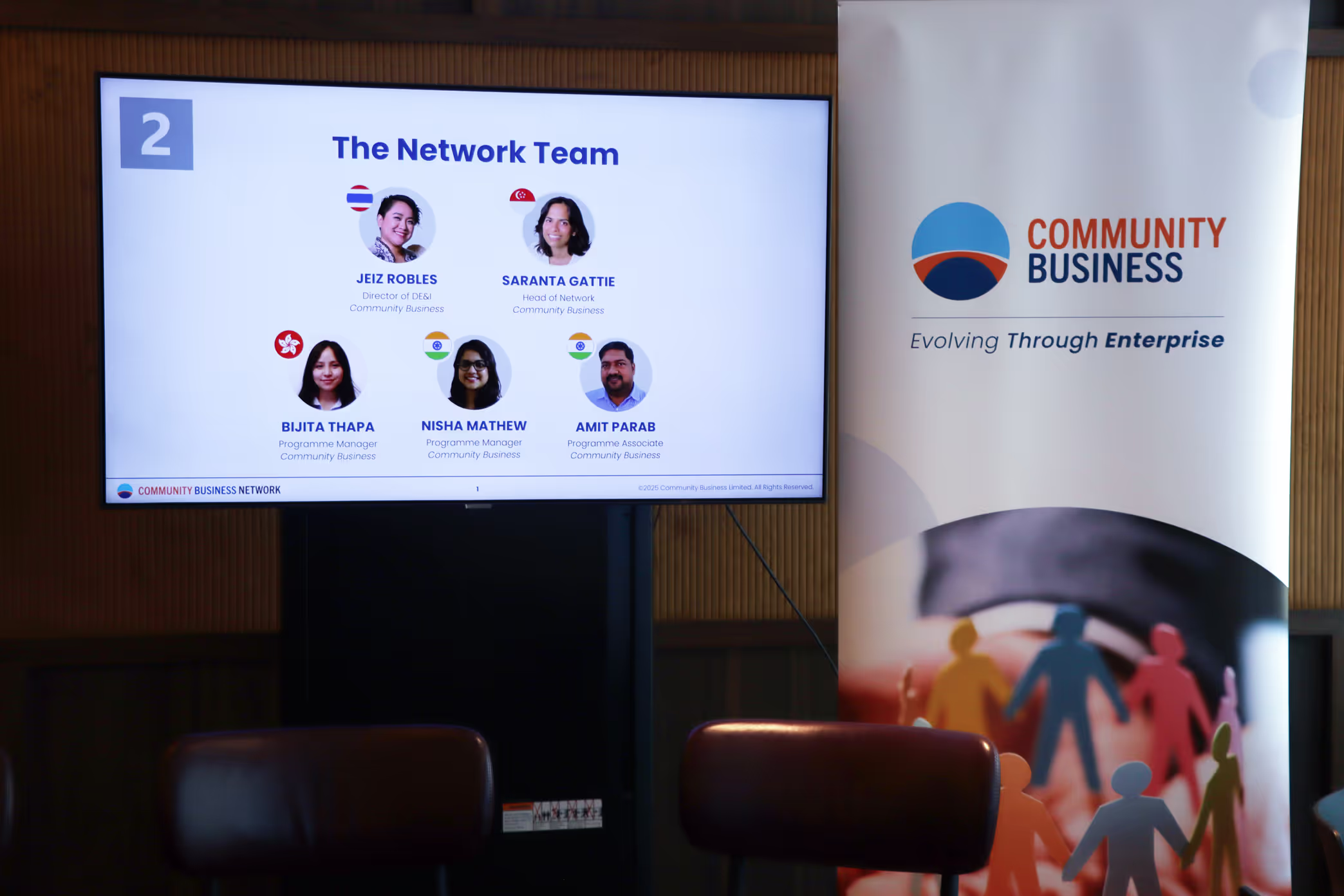
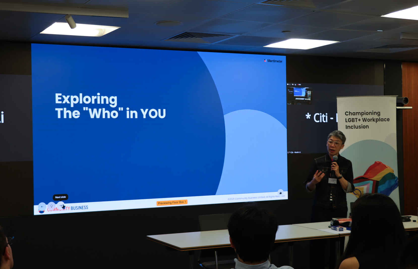
Development ran from July 2021 to launch in early 2023. The new identity was rolled out across social media, presentations, publications and event materials, touchpoints that collectively reach approximately 2 million people annually. The consolidated system replaced the fragmented sub-brand structure, giving Community Business a single recognisable identity across its membership network of 20 to 30 companies and its wider regional audience.